FRAMEWORK AND CONCEPT
The concept of Carcavelos Health Center is based on "introversion" and "introspection".
Buildings with "Health" as base program tend to be ambiguous in the feelings they generate: tranquility (healing ability) vs. fear (dangers associated with illness). Architecture plays a pivotal role in appeasing these sensations that are part of health and the implications for human life.
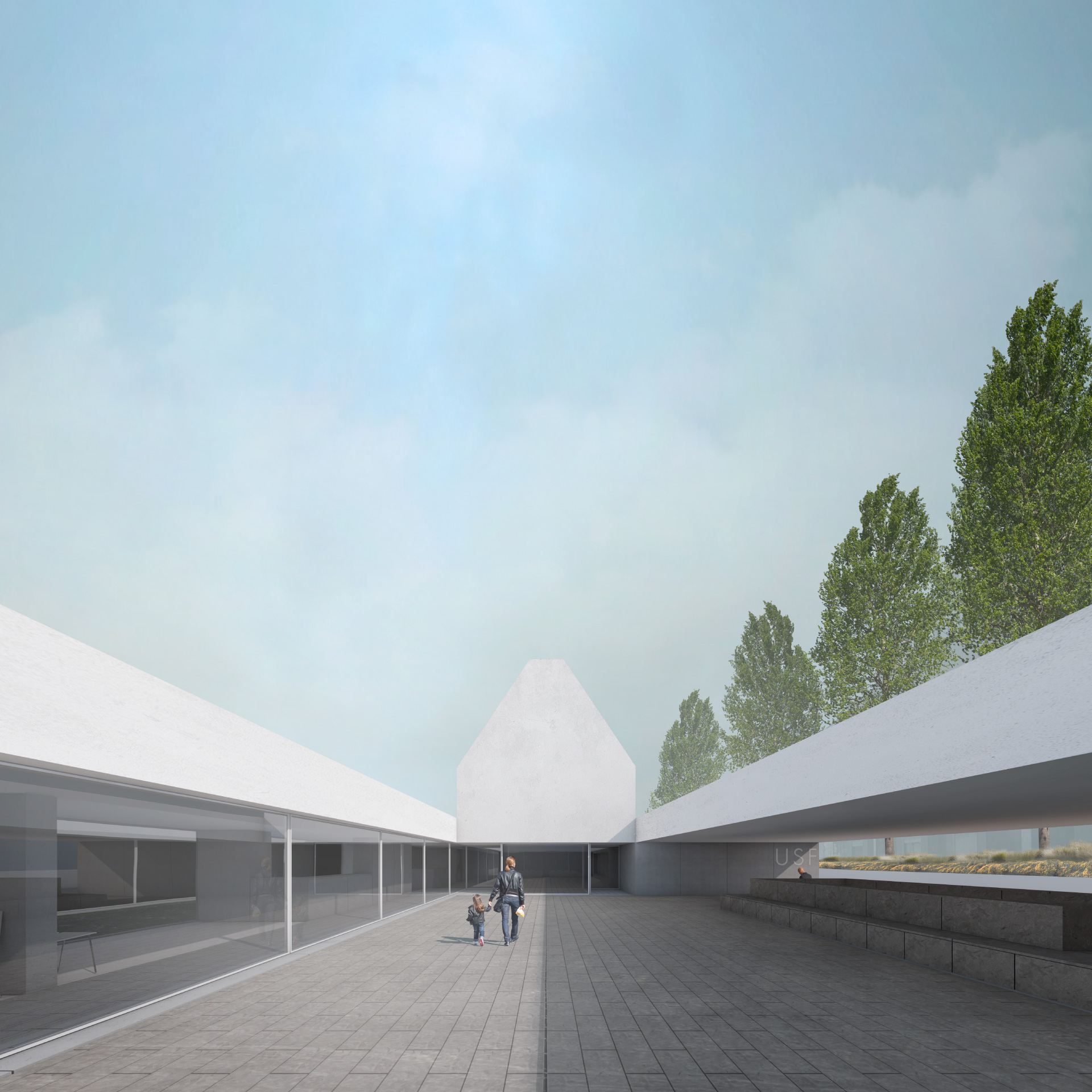
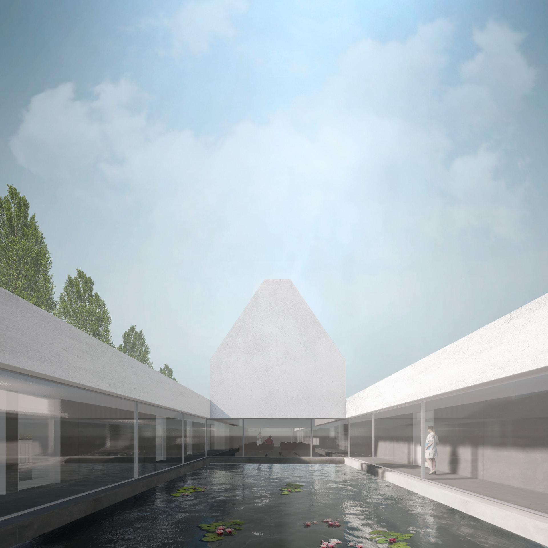
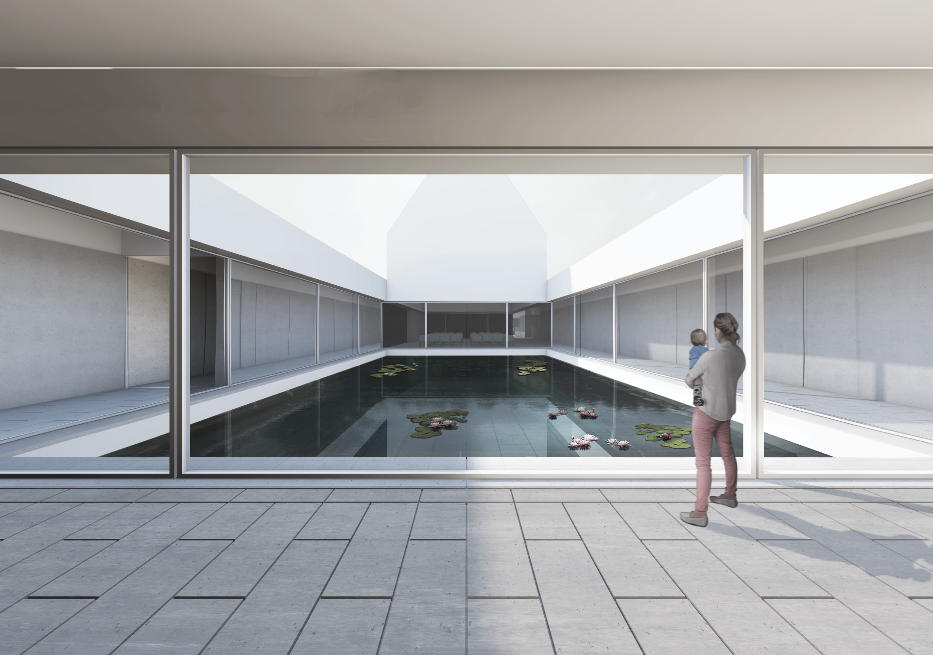
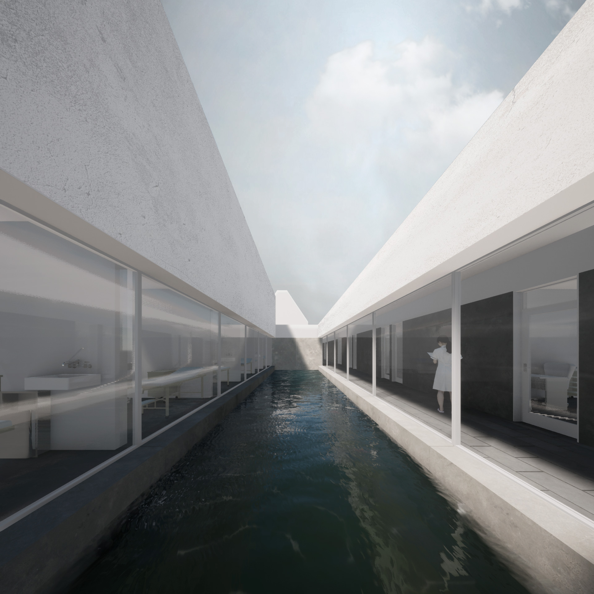
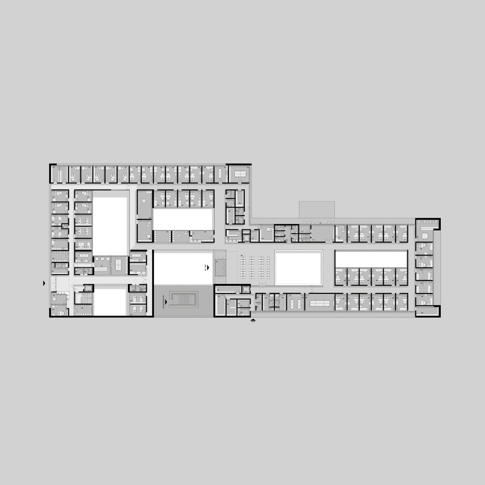
The surroundings have a weak identity verified by the urban development suffered over time. In this way, we present a less "expansive" building that faces inwards. Then, we have defined a key element in the project that allows introversion, introspection, and enhancing the sky and light as catalysts for what is essential to life: the patio. While it illuminates the interior space, the patio also qualifies living and circulation spaces, assuming itself as an essential part in the organization of the program. It also allows a calm spatial fluidity, creating levels of transparency and permeability, drawing an infinite range of possible routes to the user, which results in a rich offer at a perceptual level.
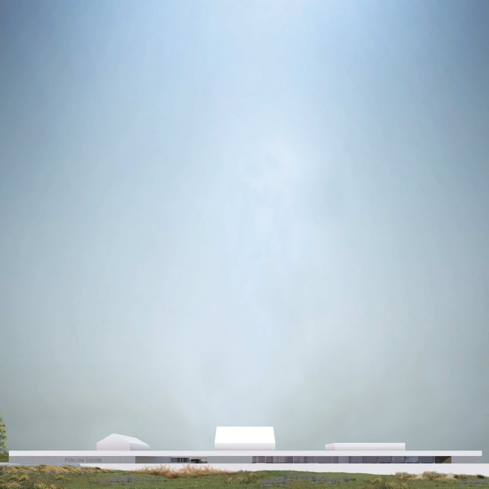
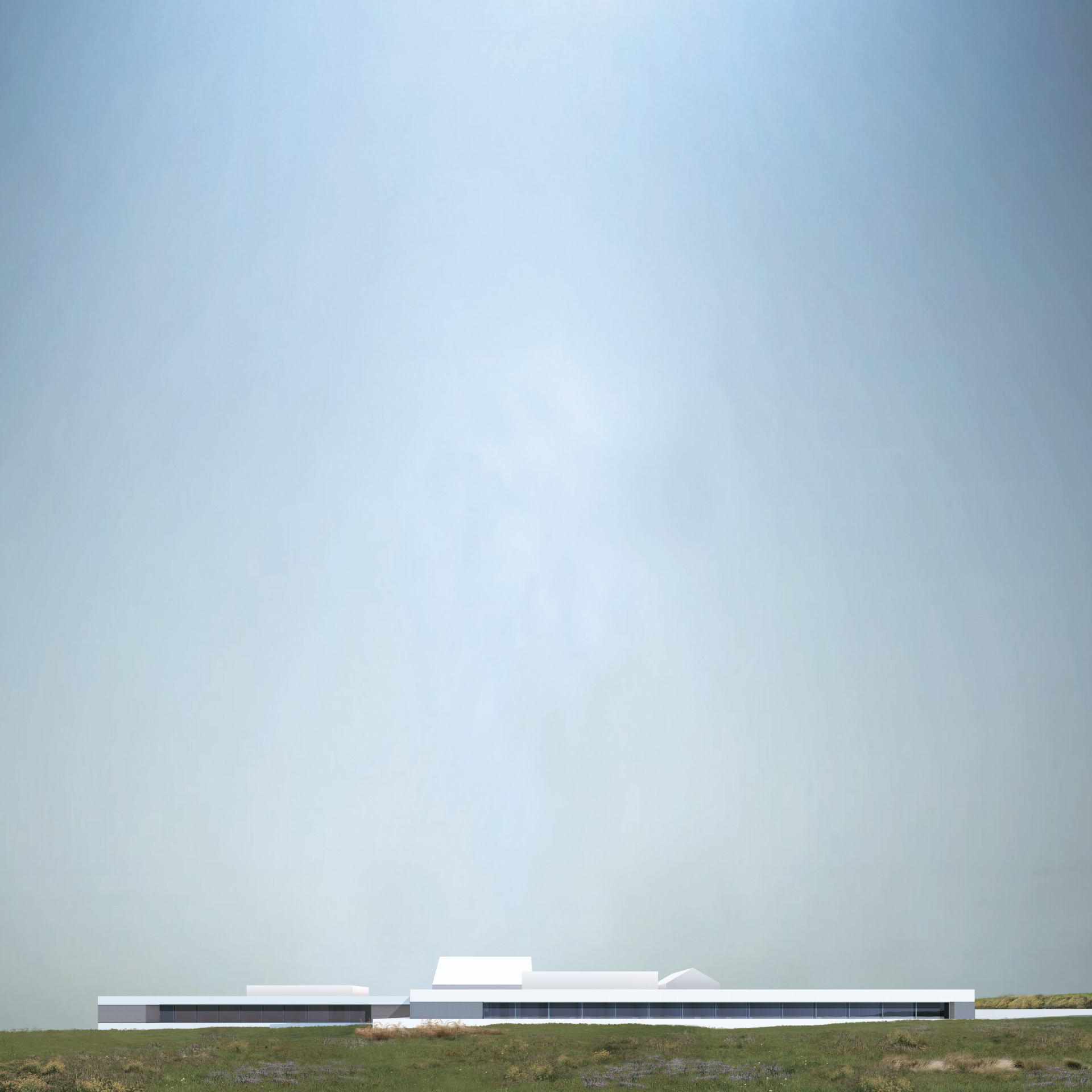
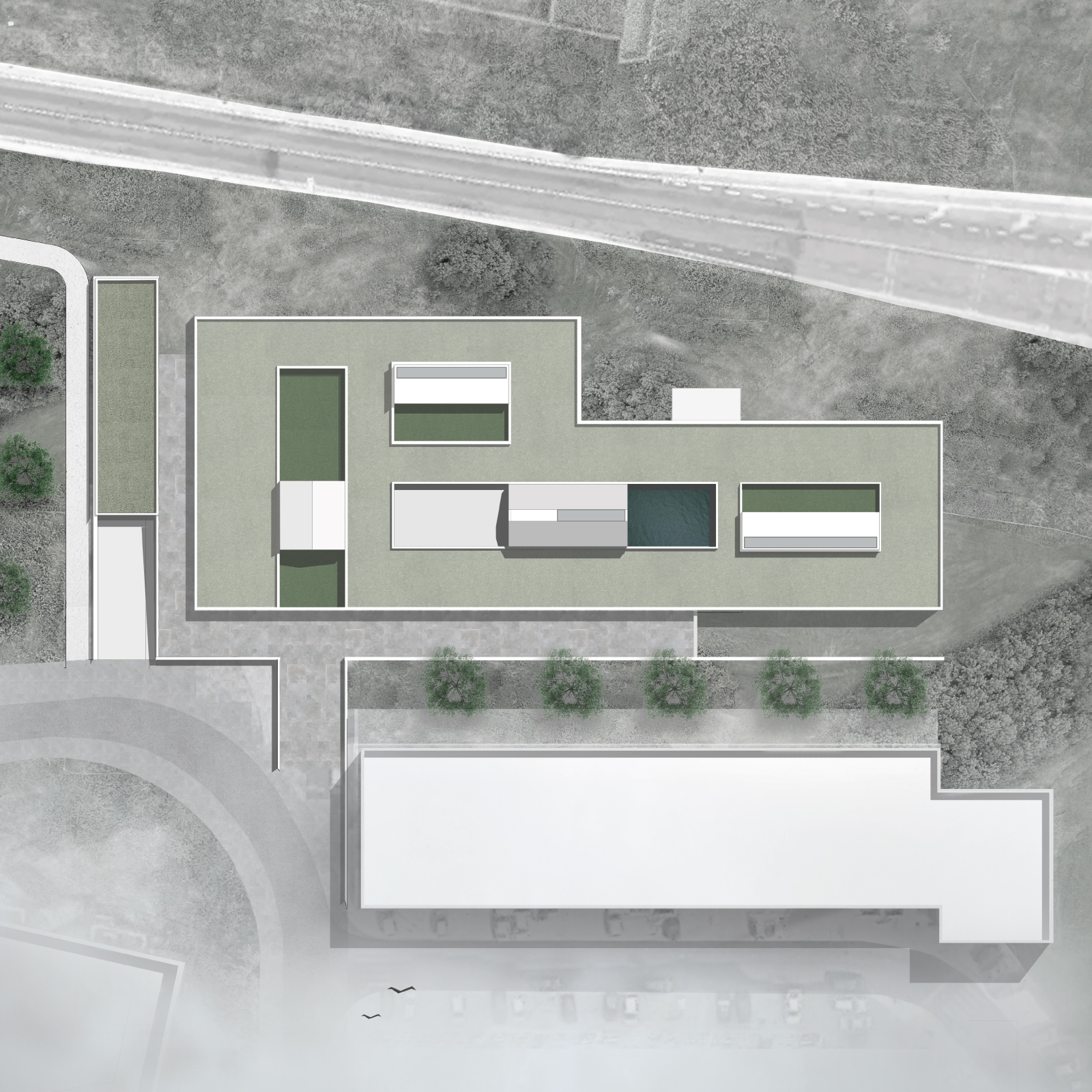
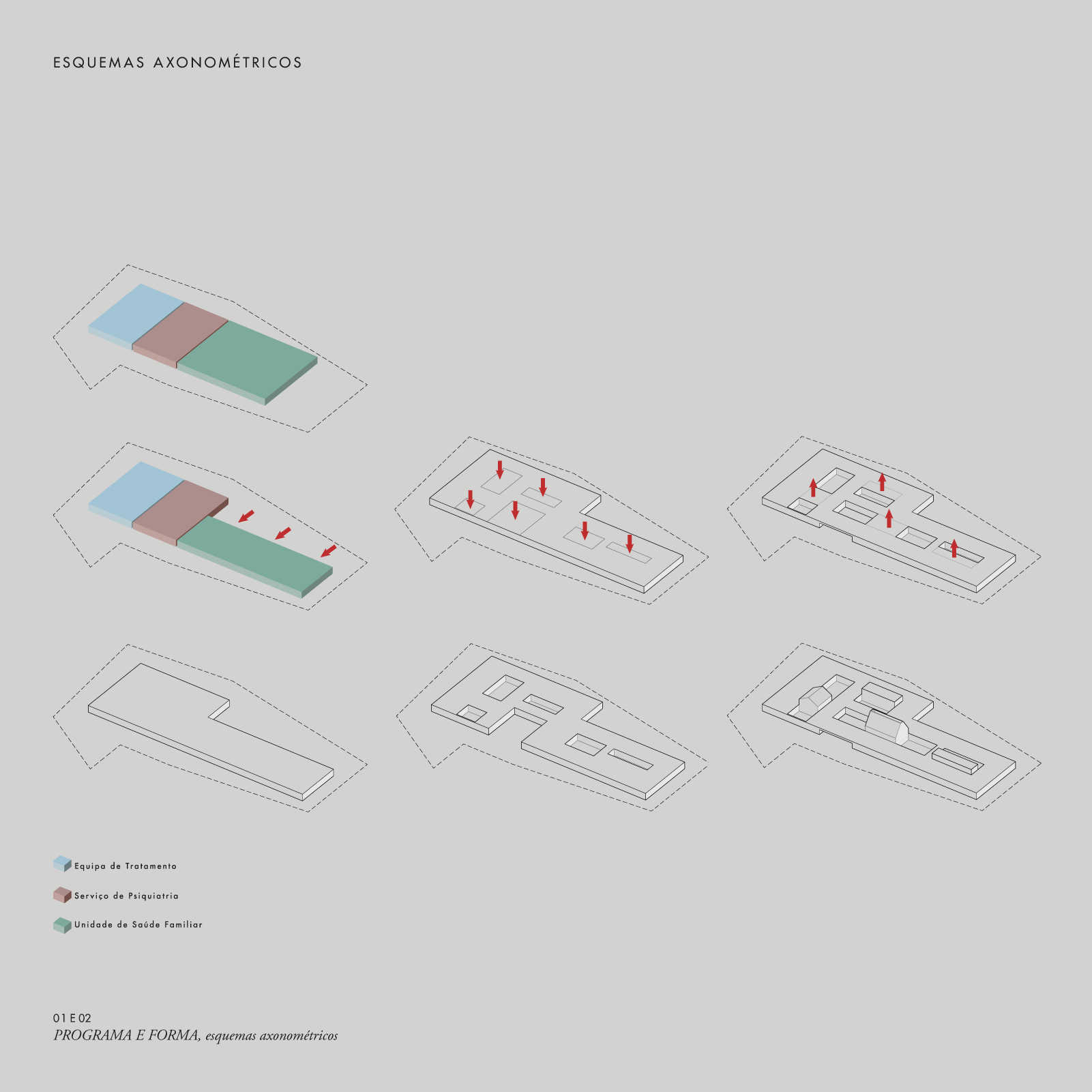
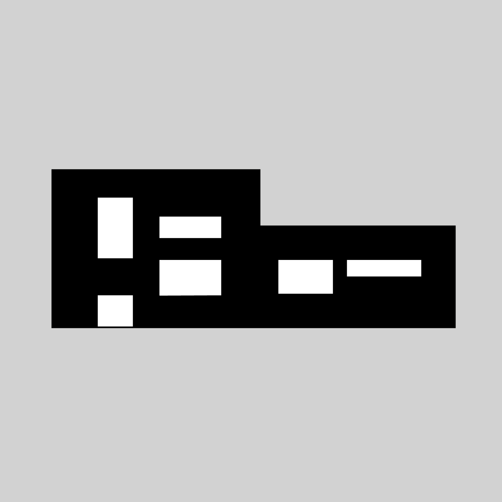
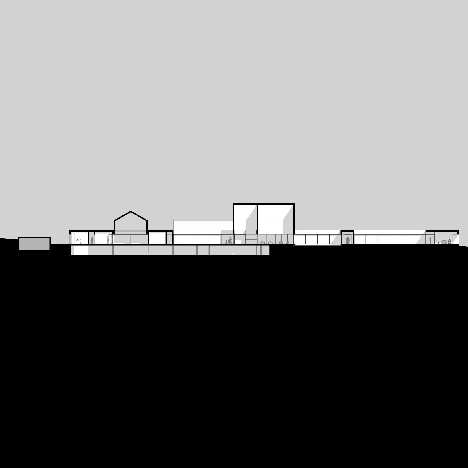
Morphologically, a patio identifies itself as a void, and the space, which architecture draws, is the full. Our proposal thus assumes itself as a compact mass of "space" in an evident game between "full and empty". We intend a volumetrically simple solution, whose horizontality can transmit tranquility, like the horizon line. In the same way that we explore this mimicry between horizon / single floor and mass, we also work on the sky / horizon / ceiling, so that there is not only a horizontal tranquility, but also a search for "lifting" and directing our gaze heaven and light - tranquility closer.
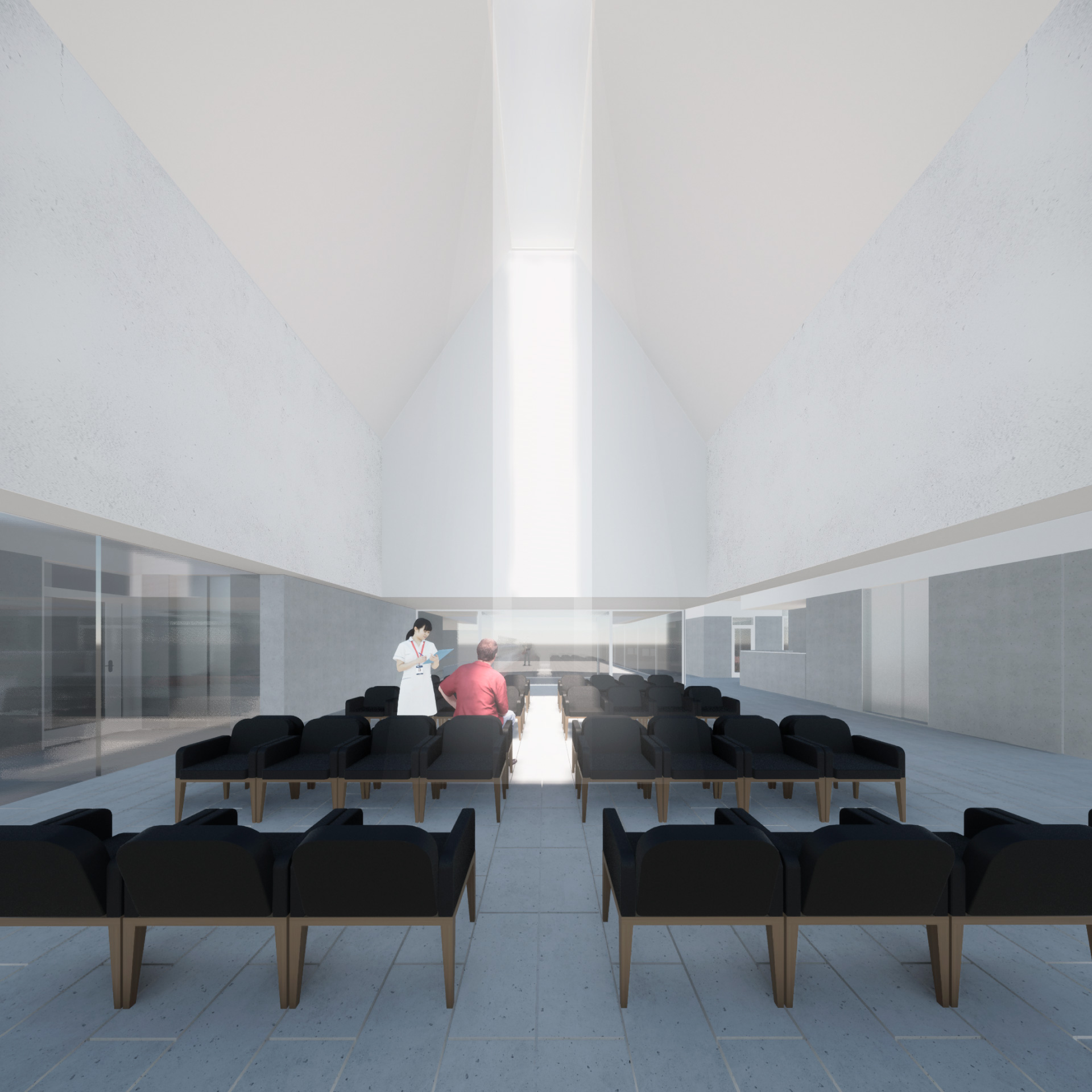
For this, volumes erupt on the horizontal mass in a singular way whose location is always associated with a patio, qualifying the interior space with double height. We emphasize the difference between the volumes because they represent two different moments: the most technical ones that allow the building to sustain itself autonomously; those that go back to the archetype idea of home. These are always associated with the two entrance patios of the different programs, as we want the building entrances to be quickly identified from the outside, always linking the idea of "well-being '' with the suggestion of the house.
IMPLANTATION
The surroundings of Carcavelos are generically characterized by residential neighborhoods and single-family houses that are interspersed with housing buildings. Occasionally there are some green spaces that give lightness to the urban area. In the area closest to the new Health Center there are also residential neighborhoods and housing buildings. interspersed with various equipment: Escola Secundária de Carcavelos, Fábrica Legrand, among others.
The implantation site has an elongated and trapezoidal shape, which the longest axis is East / West oriented, with a slight decreasing slope from West to East.
Another peculiarity of this terrain is its limits, as it combines two very different scales: a scale closer to the residential area on the South and West sides and another traffic scale on the North and East.
In this way, we opted to approach the building on the South and West side, redesigning the pedestrian path, implanting it in a long longitudinal axis of West / East orientation, occupying most of the available area. The entrance to the building is located at Rua Jacinto Isidoro Sousa, allowing a quick identification of who comes from the street, and an imagery perception from the access on the North side.
FORM AND FUNCTIONALITY
Our proposal is developed, mostly, on one floor and the entrance is made on the ground floor, in continuity and at the level of Rua Jacinto Isidoro de Sousa.
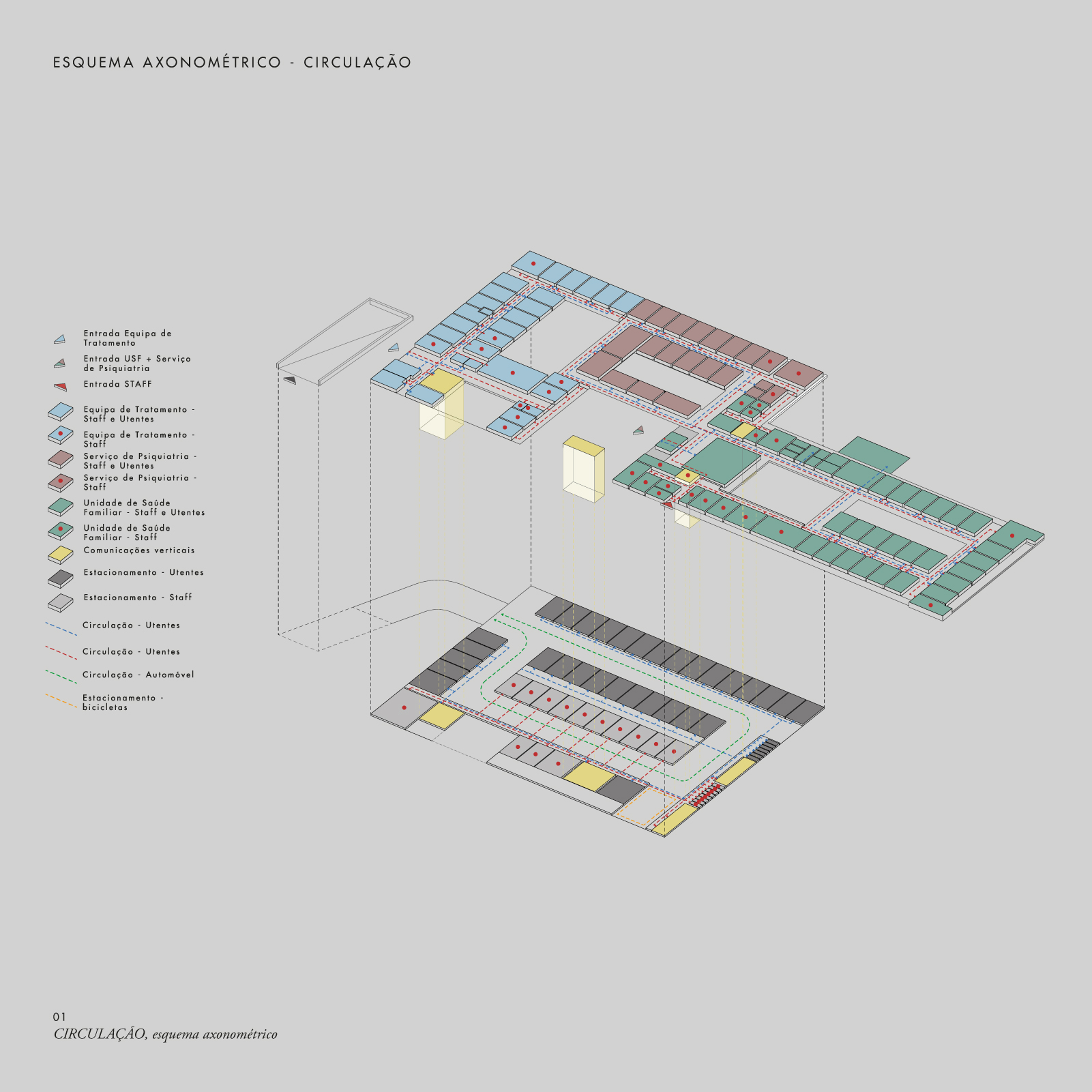
On this ground floor we have organized the three different zones, as a premise of the preliminary program: the family health unit, the psychiatric service, and the treatment team. It was imperative to start the work with the distinction of the zones and their distribution without having at the same time a break in the internal connections.
Based on the premise of the program, we propose three different entrances: one for the family health unit and psychiatry service, another for the treatment team, and a last one only for the staff, so that there is no conflict in routes and circulations. Associated with these entrances, we take our key element - "the patio" - to have '' empty "organizers and differentiators of functional natures, around which spaces are seen, to create and qualify different ambiences.
The first entrance is a large patio marked by a "truncated cone" roof that draws a wide interior space, marked by its zenith lighting, and from where the functional distribution begins. This more "public" entrance contrasts with the more "guarded" entrance of the treatment team, which is located at an opposite point that allows greater privacy.
The parking is established on the lower floor, in the basement, taking advantage of the metric of the spaces on the ground floor and partially occupying the building's implantation area. From this floor there are vertical accesses that connect to the reception of the treatment team, the reception of the family health unit and psychiatric service and staff area. In total, we have 13 parking spaces exclusively for workers at Carcavelos Health Center, 1 for reduced mobility, 8 for motorcycles and an area for bicycle parking. For users, we propose 31 parking spaces, 2 for reduced mobility, and 7 for motorcycles. The entrance of the parking, duly marked, establishes the transition between the existing and reformed pedestrian path - which connects the Escola Secundária de Carcavelos and Fábrica Legrand - and the building, being a filter between the public space and the Carcavelos Health Center.
MATERIALITY
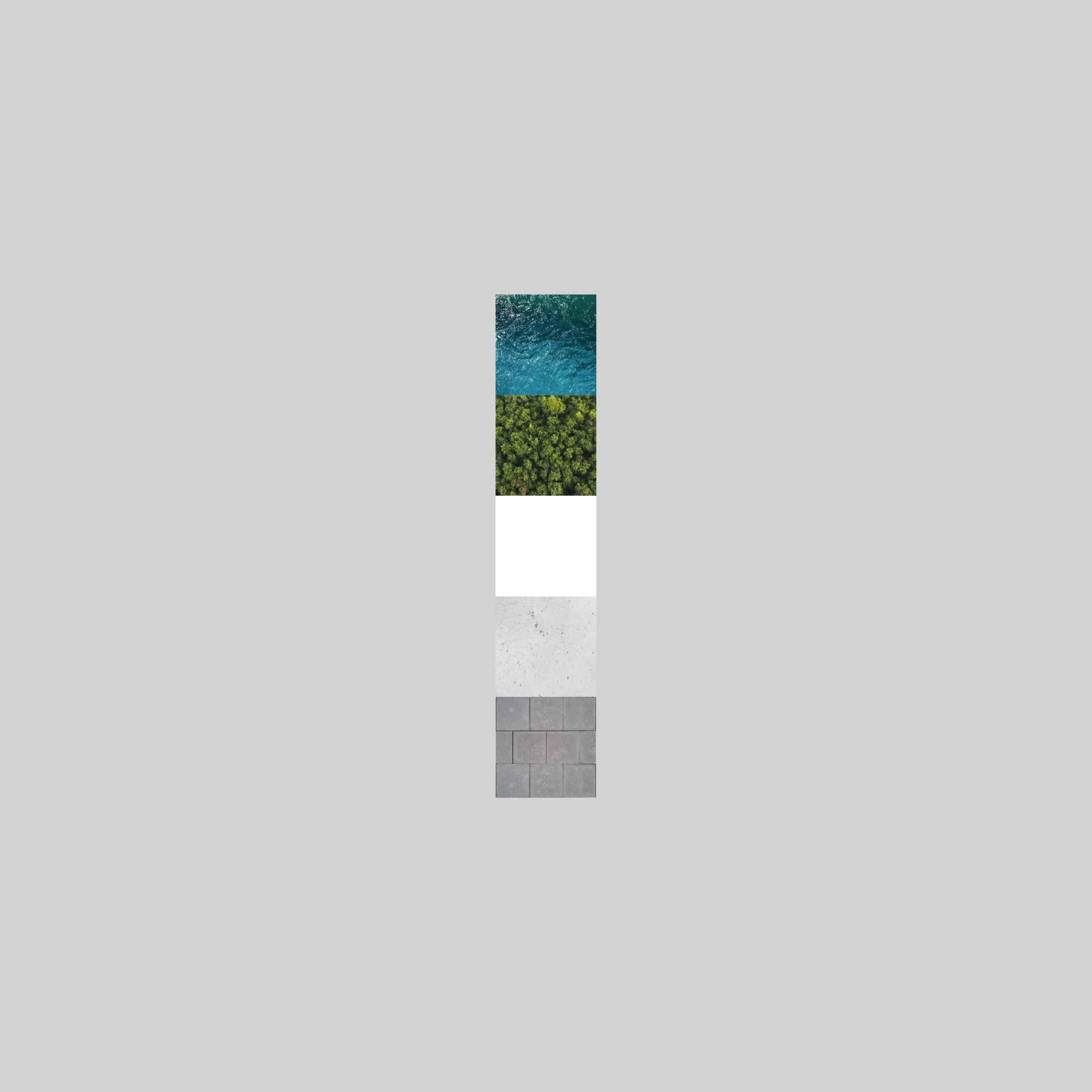
We propose to highlight the architectural simplicity of our building, which is why we chose materials that, due to their characteristics and durability, require minimal maintenance. Aware of the proximity to the sea and the most urgent and necessary concerns in terms of sustainability, from the origin of the material to the cost / benefit / maintenance factor, we opted for the use of high-performance white concrete, combining its structural function with the exterior finishing. In the basement we propose prefabricated concrete layers in a ventilated facade system, as it can reduce between 30% and 50% of the energy consumption of a building, improving thermal comfort.
For the flat roof, we propose a green roof as it allows an improvement of thermal and acoustic performance, also contributing to the renewal of air, essential for the quality of spaces. We also propose a system for the use of rainwater, reducing the use of potable water resources, using recycled rainwater to supply water mirrors (patio) and in the toilet water of sanitary facilities.
Taking advantage of the vast available coverage of the building, we think of using solar energy with photovoltaic solar panels, which will reduce electricity consumption costs. Thermal comfort in the interior is also guaranteed using double-glazed frames with thermal cut and glass with sun protection.
Concerning interior coatings, was given priority to the use of uniform materials, corresponding to the requirements that this type of institutions has. More specifically, for consultation offices and other technical spaces, multi-layer epoxy paint was recommended for the floors, both for their durability and for allowing good maintenance and easy cleaning. Regarding the vertical walls, an easily washable material was also chosen, such as the epoxy water paint.
For the noble areas, as a way of continuity from the outside to the inside, the prefabricated concrete panels were kept in the vertical walls, and in the floors, the continuity with the external pavement in limestone, so characteristic of the area where the building is inserted, interspersed with areas with multi-layer epoxy paint, for the same reasons mentioned above.
